How to Prepare Label Artwork for Print
This practical guide to print-ready label design explains how to prepare artwork for professional printing, covering file formats, colour setup, bleed, barcodes, and print-specific requirements, all based on industry-best-practice know-how from Vista Labels.
What is print-ready label artwork?
Print-ready artwork is a correctly formatted design file that can go straight into production without adjustments. For professional printing, this means artwork that is:
- Built-in professional design software
- Set up in the correct colour space.
- Supplied in the correct size with bleed and cut lines.
- Optimised for the chosen print process (digital or flexographic)
Which file formats are best for label printing?
For professional label printing, artwork must be created using industry standard applications. At Vista Labels, we recommend the following software options;
- Adobe Illustrator (.ai)
- Adobe InDesign (.indd)
- Print-ready PDF (version 1.5 or later)
- ESKO ArtPro / ArtPro+
These programs allow precise control over layers, colours, resolution, and die lines, all of which are fundamental for professional printing production.
Can I use Photoshop?
Photoshop alone isn’t suitable for complete label artwork due to resolution and registration limitations. However, it can be used to create linked images (such as PSD or TIFF files) that are placed into Illustrator or InDesign. Office programs like Word, PowerPoint, and Excel aren’t designed for commercial print and can’t be accepted.
How should colours be set up for print?
All artwork must be created in the CMYK colour space, which is used for printing. RGB colours are for screens only and will be converted automatically, often with unpredictable results.
Before submitting your files:
- Ensure documents are set to CMYK.
- Check that all linked images are also CMYK.
- Remove unused RGB colour profiles.
How many colours can be used in label printing at Vista?
The number of colours depends on the print method.
Flexographic Printing
- Up to 8 ink stations per pass
- Typically, CMYK plus up to 3 spot colours
- Additional stations may be used for white ink, metallics, varnish, or special finishes.
- Peel & reveal labels are limited to 5 colours.
Digital UV Printing
- Fixed ink set: CMYKOV + White
- Supports up to 20 Pantone swatches in artwork
- Achieves up to 90% Pantone colour accuracy
What are Pantone colours?
Pantone colours are a globally recognised colour matching system used in professional design and printing to establish consistency and accuracy in colours when they are reproduced, no matter where or how something is printed.
Instead of mixing colours differently each time (which is what happens with CMYK), Pantone colours use predefined ink formulas, so everyone involved (designers, printers, and manufacturers) works to the same colour standard. For intense brand colours, bright tones, or colour-critical designs, specify a Pantone reference.
What image resolution is required for high-quality labels?
Image resolution plays a significant role in print quality, especially at scale.
Colour or greyscale images: minimum 300ppi
Bitmap (black & white) line art: 1200ppi
Accepted formats: PSD, TIFF, or TIF
Web images, which are typically 72ppi, aren’t suitable for print and can’t be improved once saved at low resolution.
What size should label artwork be supplied at?
Artwork must be supplied at the exact label size quoted for production.
Bleed and zafe zones
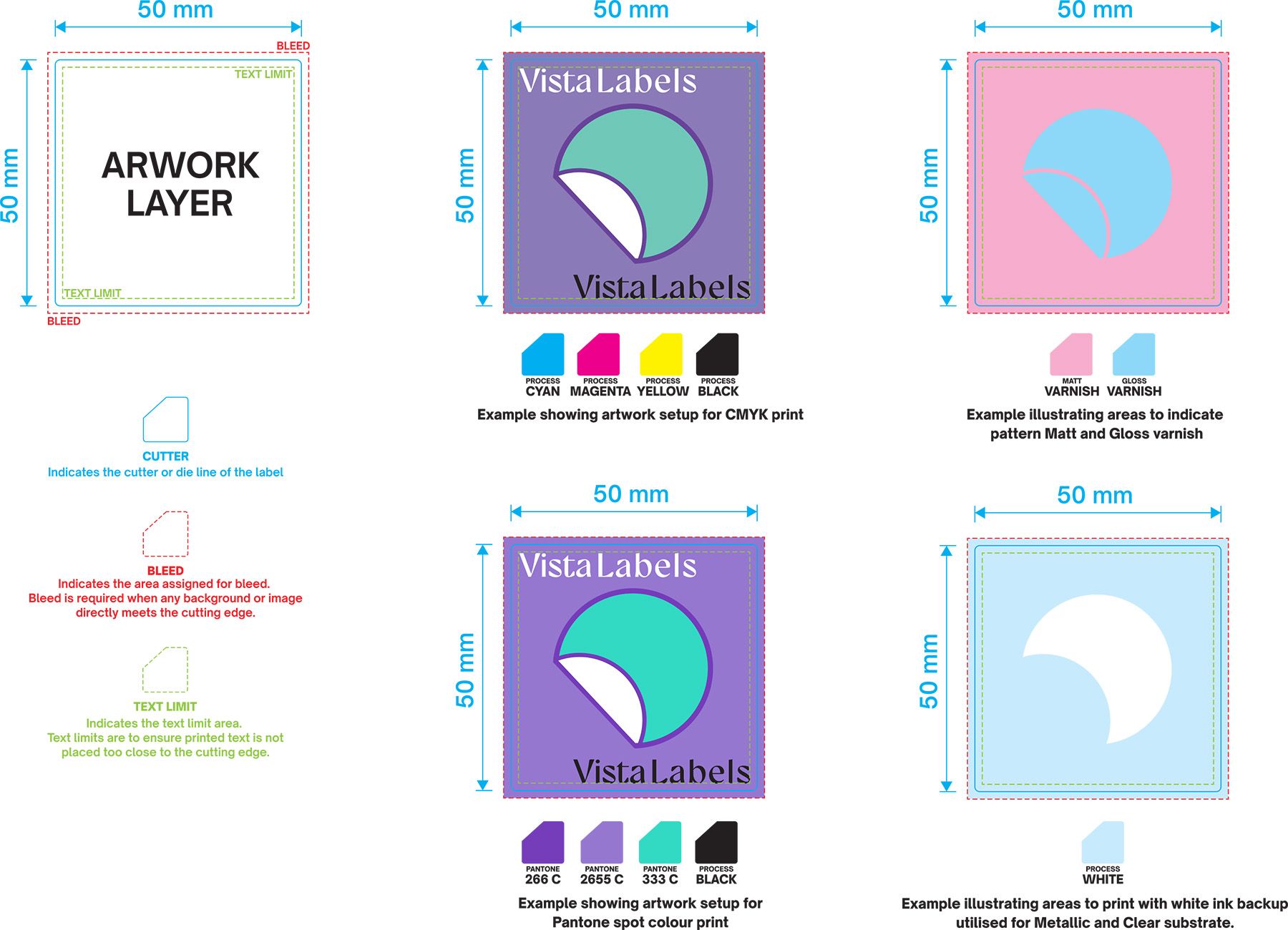
Bleed: minimum 3mm beyond the cut line
Safe area: keep text at least 1.5mm inside the edge
Designs that bleed to the edge must extend past the cut line. This ensures clean trimming during high-volume production.
How do I set up the die line (cut line)?
The die line defines the shape of your label and must be clearly marked.
- Use a custom spot colour named “CUTTER”
- Colour it 100% Cyan or Magenta for visibility.
- Place it on its own layer.
- Do not include it as part of the artwork itself.
How are spot colours, white ink, and varnish Set Up?
Spot colours
- Define all spot colours clearly in the swatch palette.
- Use correct Pantone names or numbers.
- Remove unused spot colours before submission.
White ink
- Create a spot colour named “SPOT WHITE”
- Assign a visible colour (e.g. 20% Cyan)
- Place it on a separate layer.
Varnish
- Use a custom spot colour (e.g. SPOT GLOSS / SPOT MATT)
- Place it on its own layer.
- Avoid setting white objects (0% fill) to overprint as they won’t appear in print.
How should barcodes be prepared for print?
Barcodes must be set up correctly to scan reliably during distribution and retail use.
- Never reduce barcodes below the minimum size.
- Avoid scaling or distortion.
- Maintain a clear, quiet zone around the code.
- Bars must be darker than the background.
Barcode colour and contrast
- Best option: black bars on a white background
- Avoid metallic inks or reflective surfaces.
- Reversed barcodes (light on dark) won’t scan
Barcode scan ability can’t be guaranteed if specifications aren’t met.

How should files be prepped before sending?
Before submitting your artwork, make sure you have removed unusual layers and colours and named your files clearly.
Recommended Layer Structure
- ARTWORK – printed design elements
- SPOT WHITE – white ink areas
- VARNISH – gloss or matt varnish
- CUTTER – die line
- LEGEND / NON-PRINTING – notes and instructions
What about font sizes and line widths?
Make sure to follow the minimum font sizes and line widths. Sans serif fonts should be no smaller than 4pt for positive text and 5pt for reversed text, while serif or script fonts require a minimum of 5pt positive and 6pt reversed.
Line thickness is also important: digital printing requires a minimum of 0.15mm for positive lines and 0.25mm for reversed lines, while flexographic printing requires 0.2mm for positive lines and 0.3mm for reversed lines. If any text edits are needed, be sure to include the fonts used before submitting your artwork.
Final checks
Once the Vista Labels team receives your artwork, we carefully review it and send you a digital PDF proof for your review. Once you approve the proof, your labels are typically produced and delivered within 7-10 working days.
Choose Vista Labels for print-ready Labels
Getting your artwork ready for printing can be straightforward with the right setup and expert support. If you have any questions about file preparation or print specifications, the Vista Labels team is always happy to guide you. Contact ustoday to speak with our experts and make sure your artwork is ready for print the first time.